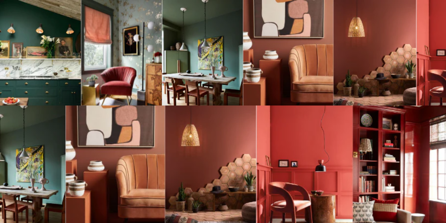
Emerging from an era of all-white minimalism, 2023 is officially the year for bold, saturated color. There’s three we’re seeing everywhere, and we’re in love. Take a look:

All Shades of Green
Greens were the first pop of color to sneak in after a decade of minimalism and neutrals- it started popping up in kitchens and on sofas, and manifested through the popularity of house plants. Sage green ruled supreme in 2022. This year, all shades of green are on parade (and I couldn’t be happier).
Perhaps the reasons green is everywhere is because it goes with any style or mood. Retro or Modern. Sage green can evoke a homey, country kitchen or a modern, spa-like, feminine bath. Rich shades of emerald, hunter, or jade can evoke earthy-bohemian or dark academia. Olive tones can create the atmosphere of a luxe Milan apartment or a desert retreat. Yet, the past few decades have been relatively spare for greens, allowing it to feel like a fresh alternative to the usual suspects of blues, grays, and reds.
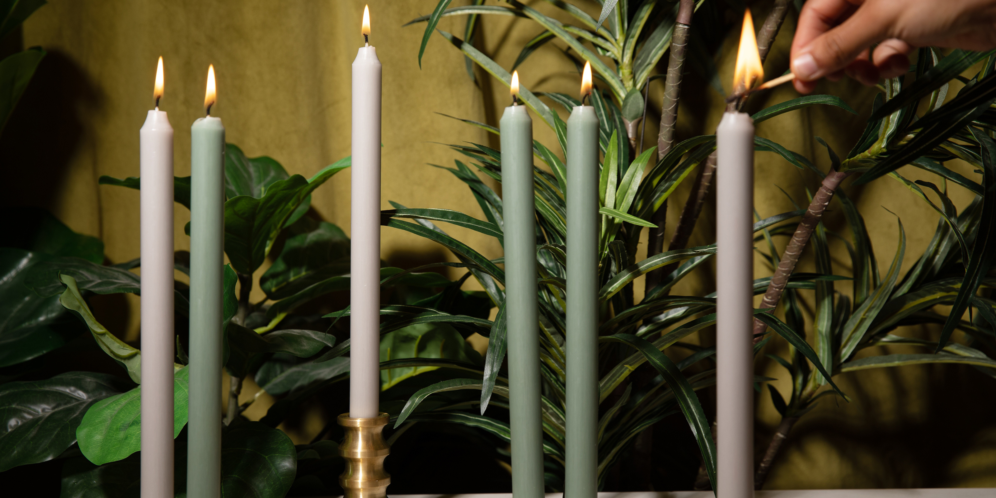
Green is a favorite at Anacua House (see: our brand color, “Winter Balsam”) and we have plenty of ways for you to add a pop of green to your room. Try stone accessories, either green marble or light green onyx, an olive-toned throw pillow, or- for the non-committal- green taper candles.
Left to right: Sage green taper candles; Aaron Probyn Como Candleholder; Botanical candle assortment; Eris soap dish and tissue box cover in green onyx; Ishi-zara plates in Wreath; Anya green marble bookends; Olivia textured cotton throw pillow cover in Olive.

Saturated Oranges
Orange is having a moment and it’s so exciting! Often left out of interior design choices for being too bold, Orange is a big statement for style-forward interiors this year. Orange can be tricky- hard to match, and the shades have seasonal appeal, but intentionally styled, can elevate your whole space.
Terracotta is an easy entry point for those wanting to try orange, but seeking a softer look. It pairs well with other muted hues like clay, sage, and mauve for a colorful upgrade to popular neutral or Scandi-inspired designs, or it can act as its own color statement against a palette of ivory and cream.
We predict vivid orange will be everywhere this summer, in the form of rich textiles, lacquered furniture, and glass accents. Orange brings a playful, modern vibe, creating a feeling of an art-forward space that doesn’t take itself too seriously. Styling orange with neutrals like ivory or white is the easy route, but life is more fun in color. Stack our Lake vase on a rich wood dresser; pair the color with vivid purple, blue, or mint green accents.
A deep, rust tone has been a favorite in recent years- a stylish upgrade to brown while still maintaining a deep, refined look. Deep rust and pumpkin tones may be everywhere each fall, but they’re relevant year-round. Right now, we’re seeing them pop up in textiles: rugs, curtains, and pillows, for a rich look that anchors the room.
Left to right: Lake vase; Amber glass French press (coming soon); Linen napkins; Olivia textured cotton pillow cover in Terracotta.

Bold Reds
Red is a perennial décor favorite coming back into style is the boldest way- saturated tones that define a room. A prime example: Benjamin Moore names Raspberry Blush, a vivacious shade of red-coral, as its color of the year.
While a straight red is a tired and often mis-used color in interior design, vibrant, nuanced shades of red like coral, brick, and merlot presented in big statements like lacquered furniture or tone-on-tone walls and upholstery are the way to go with this trend.
After what seems like millenniums of white cabinets, we’re seeing burgundy and port tones pop up in the kitchen, paired with gold-veined natural stone or striking grey marble.
Speaking of marble- the material is still very much in-demand, but people are staying from the traditional white Calcutta marble in favor of bold hues like deep cherry-red Rosso Levanto. This burgundy marble with crisp white veins that resemble lightning strikes is a stunning and unexpected accent where black and white marble usually appear- think tabletops, candleholders, bookends.
Left to right: Dilara pillow and 100% baby alpaca throw in Malbec; Kt1v Rosso Levanto Marble Bookends; Double-rectangle Velvet Pillow in Brick; Halo vases in Aubergine; Burgundy taper candles.

Mix-and-match
 The lovely thing about these colors is that they play together so well, even in the most bold iterations. Shades of mint and sage play off coral and melon for a bright, eclectic look, anchored by ivory and natural wood furniture.
Orange and red are a fun mix, either as a bright duo or slightly muted as in our American Arts and Crafts-inspired Three of Cats blanket.

If you’d like to try all three at once- check out our Abode taper candle assortment, which includes Sage, Terracotta, and Burgundy in one pack.
Check back on our website and Instagram often for new arrivals in fun colors! Shop our 2023 Color Trend Edit here.

Interiors photo credits:


Leave a comment
All comments are moderated before being published.
This site is protected by hCaptcha and the hCaptcha Privacy Policy and Terms of Service apply.