Here at Anacua House, we’re passionate about global and diverse voices in design. When our founder, Angela, saw pictures on social media of an eclectic, vibrant restaurant in Bangalore launched by a coworker from her university days, she had to reach out.
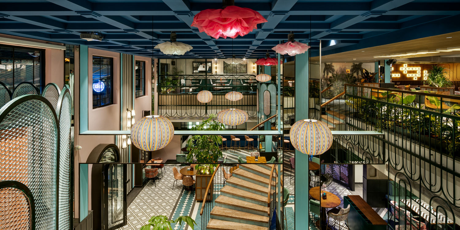
Daysie, an all-day casual bar, is making waves in the design world for its maximalist, highly-instagrammable environment that draws the city's tech-forward, trendy crowd of young professionals. The restaurant has been featured in Architectural Digest India and Conde Nast Traveller India.
Owner Anirudh Kheny holds a Masters’ in Engineering from Syracuse University and transitioned to hospitality entrepreneurship after 6 years in consulting. His wife, branding expert Neeti Gokhalay Kheny, is the design voice of their ventures. Here’s what they had to say:
AH: What are the design elements crucial for a trendy and welcoming hospitality space?
Neeti and Anirudh: It’s very important to stand out in the crowd. It has to be something that gets people's attention and generates buzz which in turn helps in the recall factor of the space when seen in pictures and videos.
Neeti: I think Daysie’s most standout feature has to be the grand staircase which connects the ground to the first floor and doubles up as a great space for guests to click their pics and selfies.
We have also done many interesting things like light fixtures in the form of typography and dynamic kinetic lights which are automatic. These lights open and close on their own and instantly get anybody’s attention. We have used a lot of fabric and tiles to create a unique design language. Then there are things like complementing crockery and glassware that add to the overall design sense of the space.

AH: How does the atmosphere fit with the food & beverage concept?
Neeti: The most important part of a restaurant's design is that it sets you up for the experience that you’re gonna have. It’s the first thing that anyone sees when they reach the place, so it has to give a clear sense of the brand and work towards elevating the overall experience. A restaurant's design is critical not just for aesthetics but also from a form and functionality point of view. From a layout that is intuitive and how the seating is arranged to how logical and efficient from the operation team's point of view, its design goes a long way in the success of the space.
Anirudh: The atmosphere of a restaurant is perhaps the most crucial aspect of customer satisfaction. You don’t just pay for the food and cocktails; you’re essentially paying for an experience. So, the tempo, vibe and energy of a place define it in the eyes of the customer and determine what the clientele will be. It shapes what the overall positioning is going to be and is a make-or-break aspect of any f&b space.
AH: How does the restaurant's design fit within the culture of your city?
Anirudh: Bangalore is a modern trendy city and people here are well travelled and appreciate good design. Daysie is a very design-heavy restaurant and people have appreciated the different aspects of the place and the detailing we have done.
We have used a lot of botanical aspects in the inside part and the outdoor parts of Daysie and as Bangalore is known as the Garden City, it ties in nicely to this.
AH: Can you tell me more about the visual design process for the space?
Neeti: It starts with a brief to the architect about what kind of customer we are aiming to target, what is the brand positioning and we also share reference images. From there we put together a mood board and once that is agreed as the visual language, we get into the layout. Post that we get to work on the materials, colours and finally 3D renders which gives us a realistic idea of how the place will finally look.

AH: Is there anything you wanted to include but couldn't?
Anirudh: We wanted to have a permanent structure in the outdoor seating section of the restaurant, which would have been great, but due to restrictions we couldn't. We however found an alternative solution which has been great too.
AH: Are there any design "lessons" you learned from any of your ventures?
Anirudh: Be very clear on what your brand is, what is your positioning, and what type of audience you intend to attract. The design elements need to talk the same language. In my experience, people want uncomplicated, easy and fun spaces. They tend not to like spaces that are unnecessarily intimidating and daunting.
AH: Do you have any other projects in the works?
Anirudh: Yes, we are currently in the process of expanding to other areas of Bangalore and into other cities in India.
Want some of their style? Shop Neeti's picks from Anacua House:

Clockwise from top left: gradiva mezcaleros; three of cats blanket; bubble candleholder; apollo bookends; Mendocino candle.

Leave a comment
All comments are moderated before being published.
This site is protected by hCaptcha and the hCaptcha Privacy Policy and Terms of Service apply.